
🔴 Website 👉 https://u-s-news.com/
Telegram 👉 https://t.me/usnewscom_channel
President Donald Trump’s dramatic changes to the design of the White House have sparked widespread attention and plenty of outrage.
From the gold-heavy Oval Office to the newly renovated presidential bathroom and the controversial ballroom project, his updates bring a distinctive aesthetic that critics say clashes with the historic White House architecture. Some have compared it to a suburban Thai restaurant, a tacky casino or a theatrical set ― emphasizing spectacle over subtlety.
HuffPost spoke with interior designers and art experts to unpack what these choices reveal about taste, power and the personal brand of the president behind them.
The vibe is ‘let them eat cake.’
“My first impression was that the redesign completely ignored the architecture it sits inside,” said interior designer Sarah Boardman. “The White House is a blend of Palladian and Georgian neoclassical design, with beautifully restrained Irish influences, soft curves, elegant proportions and detailed plasterwork that already provide all the ornament the room needs.”
She noted that past presidents have generally honored that foundation, even if they opted for slightly bolder carpets or richer fabrics.
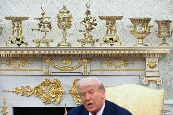
“This redesign goes in the opposite direction,” Boardman said. “The gold isn’t integrated into the architecture ― it’s layered on top of it. The appliqués and ornaments look like they were purchased in bulk and installed everywhere instead of being thoughtfully selected. It has far more in common with French Baroque and Rococo, the Versailles ‘let them eat cake’ era, than anything in the White House’s actual design lineage.”
SAUL LOEB via Getty Images
Art historian Robert Wellington, author of “Versailles Mirrored: The Power of Luxury, Louis XIV to Donald Trump,” said the aesthetic echoes not just Versailles specifically, but a broader European palace tradition that was later co-opted by America’s Gilded Age elites.
“Trump has long shown an interest in the Louis XIV style, the look and feel people associate with Versailles,” Wellington said. “What I actually see is a tradition that builds on European palace design meant to signal princely magnificence. In the Gilded Age, America’s robber barons borrowed those strategies to telegraph their own social ascendance. Trump is drawing from that and essentially bringing his kind of corporate-branding strategy to the White House. The idea is that if he surrounds himself with luxurious things, it shows he’s the kind of person who should lead the country.”
Interior designer Kelley Wagner ― who has posted many TikTok critiques of the current president’s design choices ― also drew comparisons to Louis XIV’s Versailles and even the lavish interiors shown in images of Vladimir Putin’s purported residence.
“Both the Sun King’s Versailles and Putin’s home are ‘palaces,’ and were not designed to be public spaces,” she said. “It’s my belief that President Trump has a personal affinity for these motifs because he believes they convey opulence and power.”
What makes the Versailles-esque approach particularly jarring, designers said, is how sharply it contrasts with the building it occupies, both symbolically and visually. Wagner noted that the Rococo-style gold appliqués now covering the space feel fundamentally mismatched.
“The sinewy motifs are at odds with the neoclassical style, which focuses more on geometric shapes,” she said. “Additionally, the direct application of these pieces onto the wallpaper, marble fireplace surround and the gold leafing of existing elements is a bit unconventional.”
The spectacle is the point.
“Throughout the ages, the heavy use of gold has been designed to convey wealth and power,” said Zoe Warren, an interior design expert with PriceYourJob.co.uk. “For Trump, the use of gold is about conveying a sense of success in both business and politics.”
She added that Trump’s gold aesthetic is “undeniably opulent” — a deliberate choice meant to impress and add drama in the style of Baroque interiors. Because people perceive gold as inherently high-value, its heavy use could create an immediate sense of grandeur.
JIM WATSON via Getty Images
“Gold has always been tied to status, legacy and a sense of importance, so using it so heavily in a political space sends a pretty clear message,” said Andrew Shoukry, an interior designer and founder of Shouk House. “It’s meant to feel powerful the moment you walk in. Metallic finishes feel formal and almost theatrical, while heavy fabrics and ornate details add a sense of permanence.”
That theatricality becomes even more striking in a place as symbolically important as the Oval Office.
“Covering its neoclassical detailing with gold appliqués and props turns it into a set, not a workspace,” Boardman said. “The addition of red ropes, the staged lighting, it all reads more like a soundstage than the People’s House.”
She likened the effect to other environments designed to project personal power.
“Casinos use high-gloss gold to create a sense of spectacle, wealth and heightened reality, a place where you’re meant to feel like anything can happen,” Boardman said.
Wellington also pointed to the inherently performative quality of Trump’s approach.
“There’s a lot of performativeness,” he said. “Trump can hold meetings with a foreign leader in front of the mantle that he’s decorated with all the gold trappings, and it’s the backdrop for its performance of a successful businessman who is now president.”
He added that the space carries faint echoes of the “Queen of Versailles” documentary, which followed Florida socialite Jackie Siegel and her quest to build a megamansion inspired by Louis XIV.
“The design speaks volumes about Trump’s personality,” Warren said. “He likes to be the center of attention, and the new gold-heavy Oval Office design is certainly grabbing the headlines.”
Designer and artist Isabella Segalovich similarly noted the attention-grabbing aspect of the space.
“From a pure aesthetic standpoint, the amount of one particular gold shade essentially chokes space in the room, and doesn’t allow anything else in space to breathe,” she said. “Like so many other things Trump does, it’s a demand for our attention.”
But she also sees something else at play.
“It’s important to note that Trump is something of a troll,” Segalovich said. “I think there’s a non-zero chance that he revels in the waves of outrage that come from choices like pouring concrete over the Rose Garden and demolishing the East Wing of the White House. ‘Owning the libs,’ after all, is a part of his brand as much as red hats and cheap gold decals.”
There’s a deeper symbolic impact.
Boardman emphasized that the problem isn’t just aesthetic but also philosophical.
“The Oval Office is a public room, not a personal living room,” she said. “It’s the inner sanctum of American leadership, and historically it’s been designed to project restraint, steadiness and quiet confidence. World leaders, children, military families, everyone who enters that room should feel safe and grounded.”
Across previous administrations, presidents have added personal touches while still honoring the architecture and purpose of the space.
“Even when the palettes shifted ― Reagan’s rosy taupes, Bush’s layered blues, Obama’s persimmon drapery and contemporary art ― the choices still honored the architecture and conveyed calm, civic power,” Boardman said.
Wellington echoed that point, noting that “before, it was a very sober, quiet space. It was a space for business and reflection. It was a space for the duty of office.”
MANDEL NGAN via Getty Images
Trump’s redesign, by contrast, communicates “exclusivity and hierarchy” and suggests that the public no longer has a place there.
“If he could, I suspect he’d rebuild the West Wing entirely in gold, mirrors, and marble tile, a reflection chamber instead of a place of governance, but the White House was never meant to glorify one person,” Boardman noted. “Its architecture was built to outlast them.”
The new Oval Office, she added, sends a message of personal power rather than public service.
“In this context, the gold feels like a constant reminder to himself of status, power and opulence,” Boardman said. “It reads as compensation rather than confidence, an environment designed to mirror back a specific image, even when it clashes with the room’s history and purpose.”
Interior designer Liz Potarazu made a similar point about the disconnect between the intended projection of prestige and the effect it actually creates.
“It reads less like confident leadership and more like performative authority, an aesthetic of dominance rather than an office grounded in collaboration and policy-building,” she said.
The particular shade of gold is also notable.


Interior designer Diana Lombard believes Trump’s use of ornate, high-shine gold ultimately creates the opposite effect of what he likely intended.
“Gold in a plated, high-shine finish tinges much more yellow than a true antique brass and ends up looking showy as opposed to distinguished,” she said. “Real brass, on the other hand, has depth, variation and subtlety. It’s a more nuanced, sophisticated gold that develops a natural patina over time and, in my opinion, more accurately represents craftsmanship and true luxury, and by extension signifies wealth much more than plated gold.”
Several experts noted that the gold in Trump’s Oval Office appears to skew almost green in photos, likely because of the lighting choices. That, too, makes the specific shade and finish feel out of place in the White House’s architectural context.
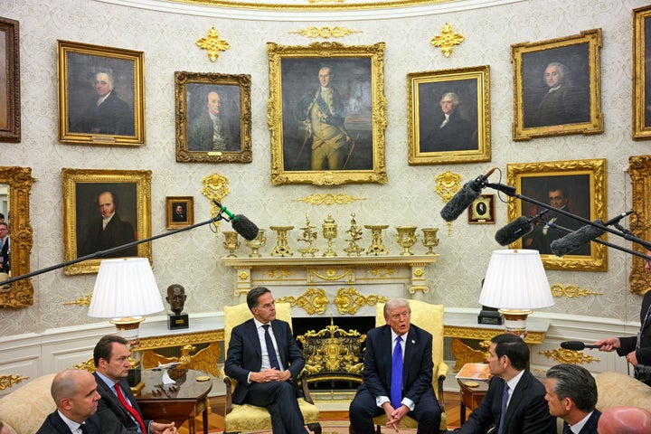
“When it sits next to the authentic gold-leaf frames of portraits like Washington or Franklin, the contrast is stark,” Boardman added. “One is historic craft ― the other is imitation. I’m not saying there isn’t a place for that aesthetic in certain settings. But this room and this architecture is not it. Because he left the existing wallpaper from his first administration, the gold clashes and the TV set lighting ramps up the canned gold.”
MANDEL NGAN via Getty Images
She emphasized that gold can work when it’s “soft, warm and used as an accent.” Trump’s first-term Oval Office leaned closer to that tradition.
“The damask wallpaper, the softer gold drapes, the coral-and-cream carpet ― it didn’t fight the room,” Boardman said, adding that the second-term redesign is quite different. “Heavy, bright, ornate gold in this quantity isn’t just decorative, it’s symbolic. In a political setting, that much metallic shine attempts to communicate dominance, hierarchy and self-focus. It shifts the Oval Office from a working space into a stage set.”
That “stage set” quality becomes even more apparent when you look at the detailing itself.
“As some have pointed out, some of the gold decals look mighty similar to cheap polyurethane decorations you can buy for as little as $1 on Chinese e-commerce website Alibaba,” Segalovich said.
Wellington noted that this isn’t just a matter of taste but of symbolism.
“One might say that some of these choices cheapen the office and make it look less dignified,” he said, “because they bring in the visual codes of capitalism and of corporate spaces.”
Its divergence from current design movements is also notable.
“I think people have had such a visceral reaction to Trump’s bathroom redesign because it diverges so drastically from what is currently trending in design,” Lombard said. “In a world saturated with AI and social media, where the line between real and artificial often feels blurred, people are gravitating toward natural, organic materials and textures that convey authenticity.”
Today’s design sensibility leans toward warmth and environments that feel genuine and welcoming, rather than overly showy or heavily ornamented.
“Contemporary design has moved even further away from heavy ornamentation,” Boardman said. “Whether in high-end residential, hospitality or institutional design, we’re seeing a shift toward softer palettes, matte finishes, natural materials, neurodivergent-friendly texture, and spaces that feel calm and grounded.”
By contrast, she added, Trump’s Oval Office “has more in common with luxury casinos, resorts and themed environments like the MGM Grand than with any current design movement.”
Potarazu observed a similar evolution across the design industry.
“In our firm, we’re seeing a strong shift toward ‘quiet luxury’ ― matte finishes, natural materials and a lot less flash,” she said. “Clients are increasingly moving away from bright, yellow-toned gold finishes and returning to more timeless metals like polished nickel, aged brass and antique bronze. There’s also the resurgence of the ‘old-money aesthetic,’ which this version of the Oval Office doesn’t quite reach. It feels quintessentially ‘new money.’”
The “Presidential Walk of Fame” and Oval Office sign are particularly bizarre additions as well.
“For me, the use of ornamentation, maximalism and even a touch of gold leaf isn’t as much of a problem as is the ridiculously outsized decals that stand out like garish flames above the framed portraits,” Segalovich said.
Ultimately, the design reflects Trump as a brand, rather than a leader of people.
“Especially at a time when his policies are making it harder for everyday people to make ends meet, it’s of course highly immoral that he chooses to flaunt how much money he’s spending on these designs,” Segalovich noted. “To me, the most important thing we can tell about Trump through his design sense is not that it’s flamboyant, but rather, that it’s soulless.”